
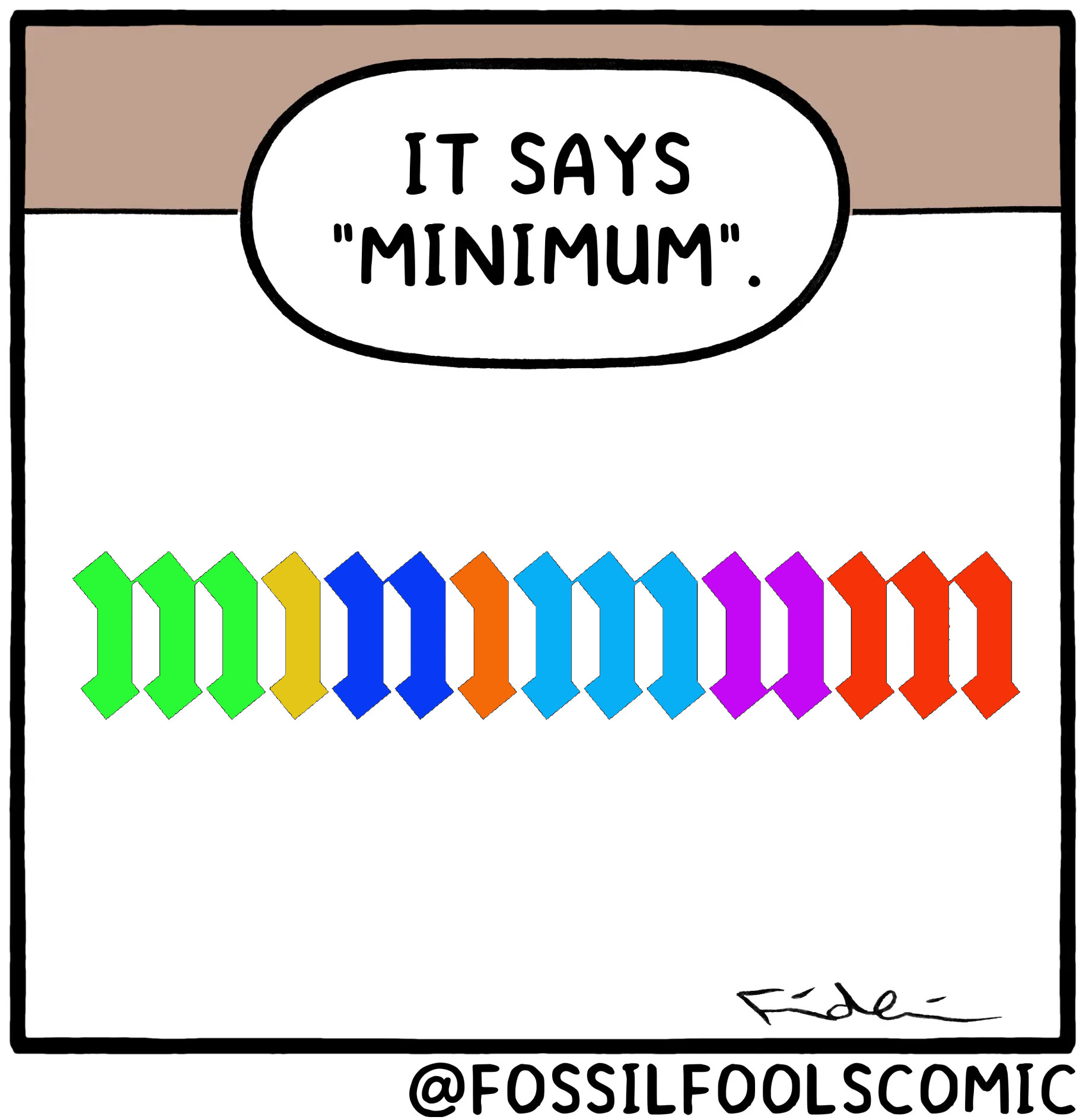
After like 5 tries and squinting and using my finger to block lines as I went along, I managed to verify for myself that it does in fact have the proper amount of lines.
It’s not just the correct amount of lines but connections between the lines are actually there, if they should be that is, if you look closely.
Oh shit you’re right
Wow. You really had to zoom in for that one. +2 to the artist for such attention to detail.
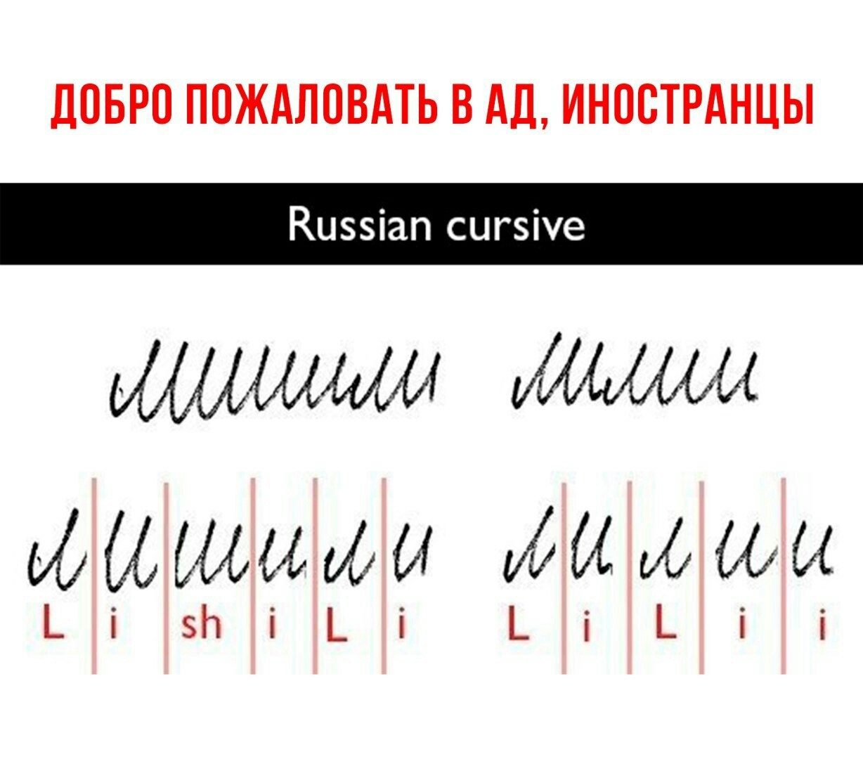
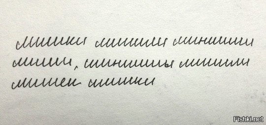
Мишки лишили шиншилл лилии, шиншиллы лишили мишек шишки
(Bears stole lily from chinchillas, chinchillas stole cone from bears)
What the fuck
calligraphy has a patron demon, not a patron saint
Titivillus has also been described as collecting idle chat that occurs during church service, and mispronounced, mumbled or skipped words of the service, to take to Hell to be counted against the offenders
Damn…that narc needs to RELAX 😆
he has an entire cult of followers, its hilarious.
(I probably just triggered them all.)
When you say “an entire cult of followers”, do you actually mean a handful of the weirdest dudes in the Vatican?
oh… no. I mean hordes of slathering buffon’s who jump on social media posts with typos.
(ooops. I did it again.)
Keming
Is this how calligraphy looks to people who can’t read cursive?
This, ladies and gentlemen, is what makes transcribing some very olde texts REALLY fucking hard.
Reminds me of Russian handwriting. Always funny to show foreigners.
Well, that’s why you add dots and stuff over the letters so it becomes “easy” to distinguish. Example Kurrent script:
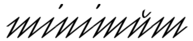
I get very anxious when someone starts such a long word so far to the right* of the page.
* obviously only for LTR direction

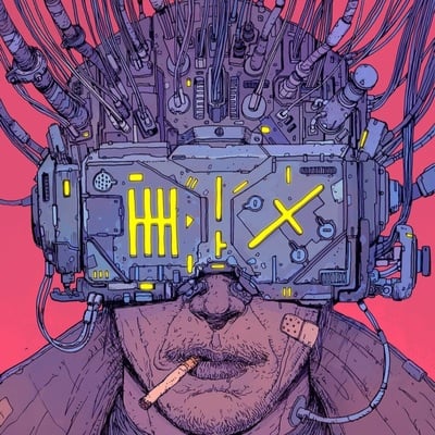
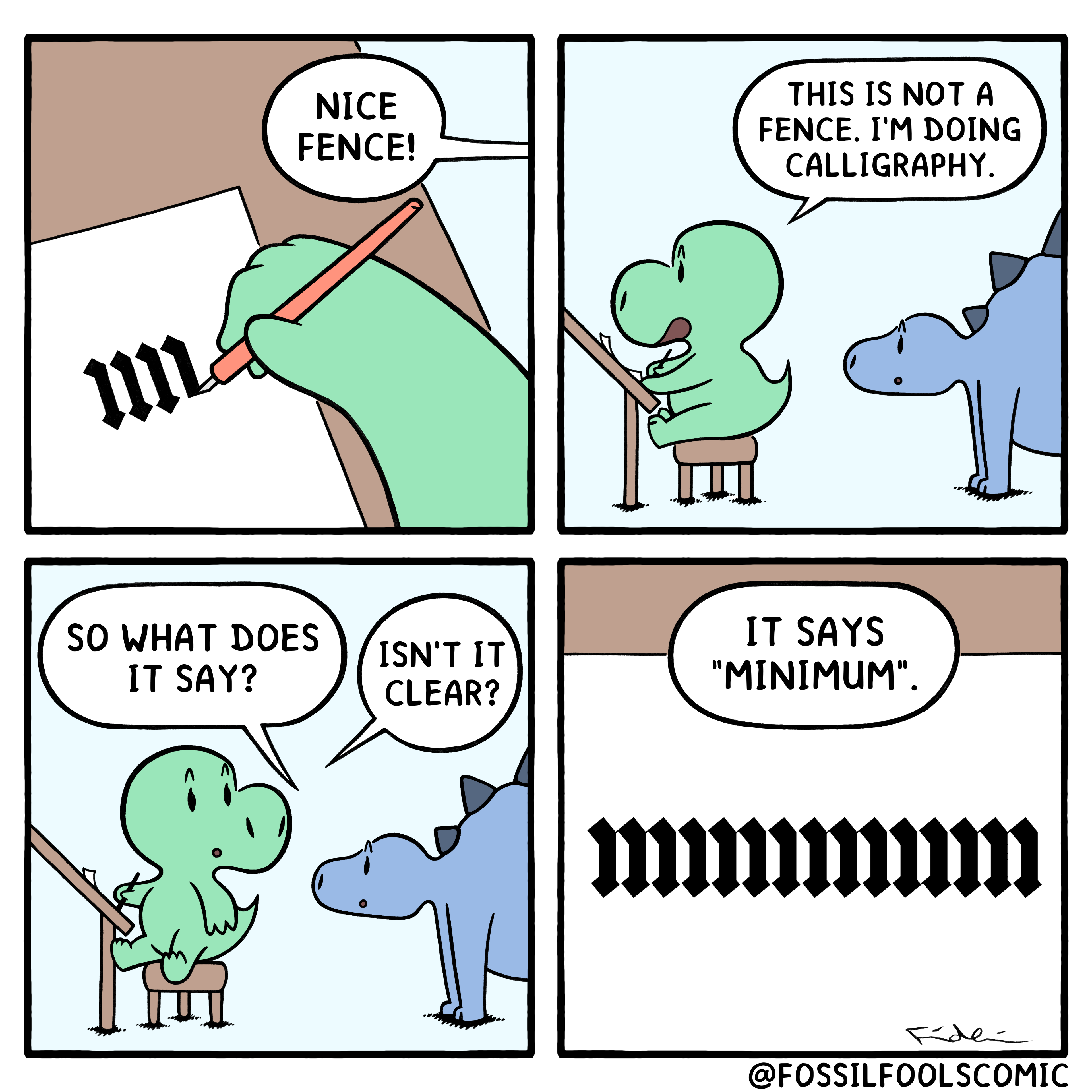
Source: Fossil Fools #135 - Minim (Calligraphy)
I don’t see an RSS Feed on their site, so here it is the RSS Feed for u/fossilfoolscomic’s submissions to r/comics:
https://www.reddit.com/r/comics/search/.rss?q=author:“fossilfoolscomic”&include_over_18=on&restrict_sr=on&t=all&sort=newThis could’ve been one panel.
How?
**


