
This strip was originally posted on !gothindustrial@lemmy.world. That post involved the original in “four panels in a horizontal row” format as found on the internet, but it had several problems.
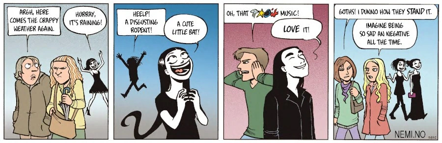
- first there was a spelling mistake where it said “…sad an negative” instead of “…and…”. Not a big deal tho, maybe it was just an abbreviation like “dunno”?
- that font makes a “G” look like a “6” or a “b”. I guess the word still makes sense in context, but it’s kind of annoying. Looking at it a bit closer, I’m pretty sure it’s a computer font rather than hand-lettered. So I edited all the "G"s to look like "G"s. and since it wasn’t hand-lettered and thus more likely a hastily-executed translation by a fan or underpaid assistant, I also changed “an” to say “and”. (I should say that the translation was well-done in terms of the words chosen tho; much better than in “Another Top”)
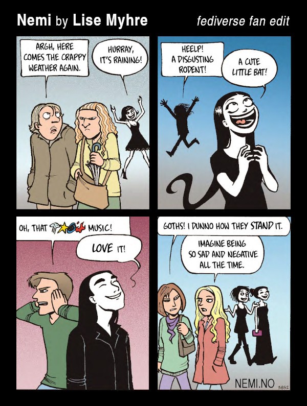
- the strip is in traditional “four panels in a horizontal row” format. maybe this looks great in newspapers I dunno but it’s kinda hard to read online. The “Another Top” post re-framed this to “four panels in a vertical column” which looks gorgeous on a phone but has problems of its own on a computer. I think I understand now why so many web comics use the “four panels in a square” format, it seems like a nice compromise. In fact, if you look at the “nemi.no” URL, it forwards you to a facebook page where a couple strips have been rather sloppily cut into a square format. I’m not hating on whoever did the quick chop job, maybe they were fans or maybe the artist doing it herself in her spare time. But I think this strip deserves a better presentation, which is why I reformatted it thus.
- the background is also made black, bc the white background just looks weird on a “dark theme” computer. Plus, it’s a cartoon about dark culture, lel. The trade-off is that if anyone wants to print out the strip, now they gotta print a lot of black ink. But I’m not sure… do people still print out cartoons these days?
- Added the name of the strip and artist. I think the artist deserves a much higher profile in the US than she currently has. The line art of the goths in panels 2 and 3 is masterful, and the background goths in panels 1 and 4 show a perfect balance of minimalism and detail. Tellingly, the non-goths all look like caricatures of actual people rather than just generic cartoon characters. Importantly, this particular strip isn’t just going for a gag, it also aims to expess a truth about “dark culture” and its relationship to the world. Anyway I think the name of the cartoon and its artist deserves to be prominently placed on the image; this isn’t usually done on the images floating around the internet. (they often have the “nemi.no” url, but this forwards to a facebook page which doesn’t even mention the artist, and which only shows 2-3 entries before refusing to do any more unless you make a facebook account.)
Anyway, this was a great educational experience, it’s really instructive to interact with media in this way.
Nemi is a character from Norway by Lise Myhre. The strip is written in Norwegian but for a while it was translated and ran in England. The character is into metal, industrial, goth, and “dark culture” in general. For more info: https://en.wikipedia.org/wiki/Nemi_(comic_strip)
No, just kind of lazy.
Ain’t nobody got time to make up special bullshit names for everything
There’s probably a very long German word made up of other words for that.
How about “Worterfindungszeitmangel”?