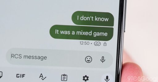
Following the last redesign in early 2023, Google Messages is testing a new look for read receipts in RCS conversations…
You must log in or # to comment.
Just got the redesign today. Somehow found a way to make more cluttered, less easy to understand, and more ambiguous. Seriously, the difference between “read” and “sent” is a half shade of color and a razor thin outline. It’s hard to imagine Google was once a leader in the UX space.
Words would be so much easier to understand.
booo when RCS in QUIK.
Soon, my friend. Soon. :)
check github, we’re trying to figure out how to use RCS/imessage features without needing a server.
wait, so you’re the QUIK developer or one of the developers. cool 👍


